dotools_py.pl.split_bar_gsea#
- dotools_py.pl.split_bar_gsea(df, term_col, col_split, cond_col, pos_cond, cutoff=40, log10_transform=True, figsize=(12, 8), topn=10, colors_pairs=('sandybrown', 'royalblue'), alpha_colors=0.3, path=None, spacing=5, txt_size=12, filename='SplitBar.svg', title='Top 10 GO Terms in each Condition', show=True)[source]#
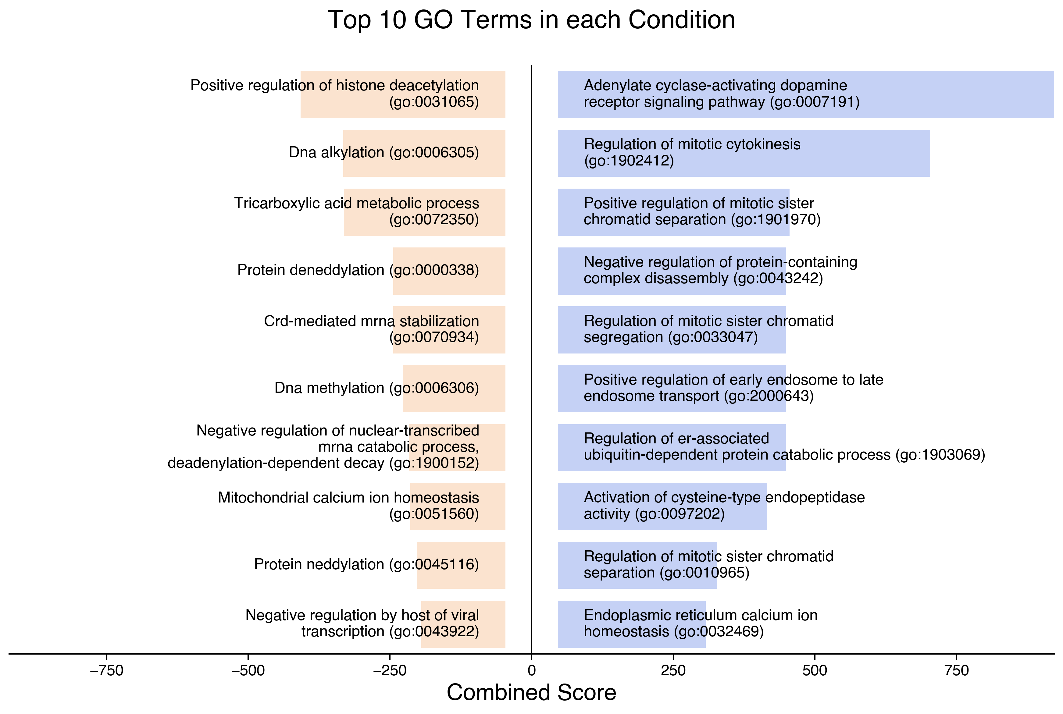
Split BarPlot for GO terms.
This function generates a split barplot. This is a plot where the top 10 GO terms are shown, sorted based on a column
col_split. Two conditions are shown at the same time. One condition is shown in the positive axis, while the other in the negative one. The condition to be shown as positive is set withpos_col.Warning
Expected a filtered dataframe containing only significant Terms
- Parameters:
- df
DataFrame dataframe with the results of a gene set enrichment analysis.
- term_col
str column in the dataframe that contains the terms.
- col_split
str column in the dataframe that will be used to sort and split the plot.
- cond_col
str column in the dataframe that contains the condition information.
- pos_cond
str condition that will be shown in the positive side of the plot.
- cutoff
int(default:40) maximum number of characters per line.
- log10_transform
bool(default:True) if col_split contains values between 0 and 1, assume they are pvals and apply a -log10 transformation.
- figsize
tuple[int,int] (default:(12, 8)) figure size.
- topn
float(default:10) how many terms are shown.
- path
str|PathLike[str] |Path(default:None) path to save the plot.
- filename
str(default:'SplitBar.svg') filename for the plot.
- spacing
float(default:5) space to add between bars and origin. It is a percentage value, indicating that the bars start at 5 % of the maximum X axis value.
- txt_size
float(default:12) size of the go terms text.
- alpha_colors
float(default:0.3) alpha value for the colors of the bars.
- colors_pairs
list(default:('sandybrown', 'royalblue')) colors for each condition (1st color –> negative axis; 2nd color –> positive axis).
- title
str(default:'Top 10 GO Terms in each Condition') title of the plot.
- show
bool(default:True) if False, the axis is return.
- df
- Return type:
- Returns:
Depending on
show, returns the plot if set toTrueor a dictionary with the axes.
Example
import dotools_py as do
adata = do.dt.example_10x_processed()
do.tl.rank_genes_groups(adata,  'condition', method='wilcoxon', tie_correct=True, pts=True)
table = do.get.dge_results(adata)
table = table[table.group == 'disease']
table_go = do.tl.go_analysis(table, 'GeneName', 'padj', 'log2fc', specie='Human', go_catgs = ['GO_Molecular_Function_2023', 'GO_Cellular_Component_2023', 'GO_Biological_Process_2023'])
table_go = table_go[table_go['P-value'] < 0.25]
do.pl.split_bar_gsea(table_go, 'Term', 'Combined Score', 'state', 'enriched', show=True)