dotools_py.pl.heatmap#
- dotools_py.pl.heatmap(adata, x_axis, features, y_axis=None, xticks_order=None, yticks_order=None, layer=None, logcounts=True, figsize=(5, 6), ax=None, swap_axes=True, title='', title_fontproperties=None, palette='Reds', xticks_properties=None, xticks_rotation=45, yticks_properties=None, yticks_rotation=0, cluster_x_axis=False, cluster_y_axis=False, legend_title='LogMean(nUMI)\\nin group', path=None, filename='Heatmap.svg', show=True, add_stats=None, test='wilcoxon', correction_method='benjamini-hochberg', df_pvals=None, stats_x_size=None, square_x_size=None, pval_cutoff=0.05, log2fc_cutoff=0.0, z_score=None, clustering_method='complete', clustering_metric='euclidean', linewidth=0.1, vmin=None, vcenter=None, vmax=None, annot_fontsize=12, annot_ratio=0.35, **kwargs)[source]#
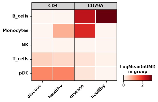
Makes a 2d or 3d heatmap.
- There are two type of visualization:
- 2d heatmap: X_axis shows
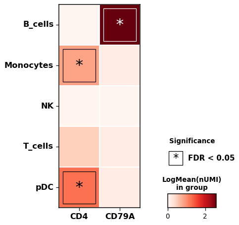
x_axiscategories and Y_axis thefeatures. The color represents the logarithmize mean nUMI.
- 2d heatmap: X_axis shows
- 3d dotplot: X_axis shows
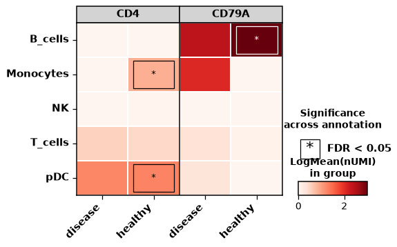
x_axiscategories and Y_axis showsy_axiscategories. For each feature the x_axiscategories will be duplicated, to show how is the expressing across 2 categorical columns in.obs. The color represents the logarithmize mean nUMI.
- 3d dotplot: X_axis shows
Differential gene expression analysis between the different groups can be performed.
- Parameters:
- adata
AnnData Annotated data matrix.
- x_axis
str Name of a categorical column in
adata.obsto groupby.- features
str|list A valid feature in
adara.var_namesor column inadata.obswith continuous values. The order of the features is maintained.- y_axis
str|None(default:None) A valid feature in
adara.var_namesor column inadata.obswith continuous values.- xticks_order
list|None(default:None) Order for the categories in
adata.obs[x_axis]- yticks_order
list|None(default:None) Order for the categories in
adata.obs[y_axis]- layer
str|None(default:None) Name of the AnnData object layer that wants to be plotted. By default,
adata.Xis plotted.- logcounts
bool(default:True) Set to
Trueif the input data is in logspace.- figsize
tuple(default:(5, 6)) Figure size, the format is (width, height).
- ax
Axes|None(default:None) Matplotlib axes to use for plotting. If not set, a new figure will be generated.
- swap_axes
bool(default:True) Whether to swap the x_axis categories and features. Only used if y_axis is set to None.
- title
str(default:'') Title for the figure.
- title_fontproperties
Optional[Dict[Literal['size','weight'],str|int]] (default:None) Dictionary which should contain ‘size’ and ‘weight’ to define the fontsize and fontweight of the title of the figure.
- palette
str(default:'Reds') String denoting matplotlib colormap.
- xticks_properties
dict|None(default:None) Dictionary which should contain ‘size’ and ‘weight’ to define the fontsize and fontweight of the font of the x-axis.
- xticks_rotation
int(default:45) Rotation of the x-ticks.
- yticks_properties
dict|None(default:None) Dictionary which should contain ‘size’ and ‘weight’ to define the fontsize and fontweight of the font of the y-axis.
- yticks_rotation
int(default:0) Rotations of the y-ticks.
- cluster_x_axis
bool(default:False) Hierarchically clustering the x-axis.
- cluster_y_axis
bool(default:False) Hierarchically clustering the y-axis.
- legend_title
str(default:'LogMean(nUMI)\\nin group') Title for the colorbar.
- path
str|PathLike[str] |Path|None(default:None) Path to the folder to save the figure.
- filename
str(default:'Heatmap.svg') Name of file to use when saving the figure.
- show
bool(default:True) If set to
False, returns a dictionary with the matplotlib axes.- add_stats
Optional[Literal['x_axis','y_axis']] (default:None) Add statistical annotation. Will add a square with an ‘*’ in the center if the expression is significantly different in a group with respect to the others.
- test
Literal['wilcoxon','t-test'] (default:'wilcoxon') Name of the method to test for significance.
- correction_method
Literal['benjamini-hochberg','bonferroni'] (default:'benjamini-hochberg') Correction method for multiple testing.
- df_pvals
DataFrame|None(default:None) Dataframe with the pvals.
- stats_x_size
float|None(default:None) Scaling factor to control the size of the asterisk.
- square_x_size
dict|None(default:None) Size and thickness of the square.
- pval_cutoff
float(default:0.05) Cutoff for the p-value.
- log2fc_cutoff
float(default:0.0) Minimum cutoff for the log2FC.
- z_score
Optional[Literal['x_axis','y_axis']] (default:None) Apply z-score transformation.
- clustering_method
str(default:'complete') Linkage method to use for calculating clusters. See scipy.cluster.hierarchy.linkage.
- clustering_metric
str(default:'euclidean') Distance metric to use for the data. See scipy.spatial.distance.pdist.
- linewidth
float(default:0.1) Linewidth for the border of cells.
- vmin
float|None(default:None) The value representing the lower limit of the color scale.
- vcenter
float|None(default:None) The value representing the center of the color scale.
- vmax
float|None(default:None) The value representing the upper limit of the color scale.
- annot_fontsize
float(default:12) Fontsize of the features text in 3d heatmaps.
- annot_ratio
float(default:0.35) Fraction of the figure reserved for the feature text in 3d heatmaps.
- kwargs
Additional arguments pass to sns.heatmap.
- adata
- Returns:
Depending on
show, returns the plot if set toTrueor a dictionary with the axes.
Example
Create a 2d heatmap and add statistical information
import dotools_py as do
adata = do.dt.example_10x_processed()
do.pl.heatmap(adata, 'annotation', ['CD4', 'CD79A'], add_stats="x_axis")
Create a 3d heatmap grouping also by condition
do.pl.heatmap(adata, 'condition',  ['CD4', 'CD79A'], 'annotation', figsize=(6, 4))

# Add Statistical significance for groups with pvals < 0.05 and log2fc > 0.0
# Note, the object is quite small, some groups cannot be tested for having one condition only.
do.pl.heatmap(adata, 'condition', ['CD4', 'CD79A'], 'annotation', figsize=(6, 4), add_stats='y_axis')