dotools_py.pl.barplot#
- dotools_py.pl.barplot(adata, x_axis, feature, batch_key='batch', hue=None, hue_order=None, layer=None, logcounts=True, figsize=(3, 4.2), palette=None, title=None, title_fontproperties=None, xticks_order=None, xticks_rotation=45, ylabel='LogMean(nUMI)', ylim_max=None, legend_title=None, legend_fontproperties=None, legend_ncols=1, legend_loc='center left', path=None, filename='barplot.svg', show=True, ax=None, reference=None, groups=None, groups_pvals=None, test='wilcoxon', corr_method='benjamini-hochberg', line_offset=0.05, txt_size=13, txt='p = ', capsize=0.1, marker_size=6, estimator='logmean', **kwargs)[source]#
Barplot with statistical significance.
Show the average expression of features in
adata.var_namesor a continuous value inadata.obsalong different categorical values and test for significance. The mean pseudo-bulk expression per sample will be plotted as dots.- Parameters:
- adata
AnnData Annotated data matrix.
- x_axis
str Name of a categorical column in
adata.obsto groupby.- feature
str A valid feature in
adata.var_namesor column inadata.obswith continuous values.- batch_key
str(default:'batch') Name of a categorical column in
adata.obsthat contains the sample names.- hue
str(default:None) Name of a second categorical column in
adata.obsto use additionally to groupby.- hue_order
list(default:None) List with orders for the categories in
hue. If it is not set, the order will be inferred.- layer
str(default:None) Name of the AnnData object layer that wants to be plotted. By default,
adata.Xis plotted. If layer is set to a valid layer name, then the layer is plotted.- logcounts
bool(default:True) If set to
True, the log-transformed mean will be shown (i.e, LogMean(nUMI)), otherwise the Mean(nUMI) is shown.- figsize
tuple[float,float] (default:(3, 4.2)) Figure size, the format is (width, height).
- palette
str|dict|Colormap|None(default:None) String denoting matplotlib colormap. If not set, it will try to access
adata.uns[hue_colors | x_axis_colors], if not the colormapdo.utility.tab30()will be used. A dictionary with the categories available inadata.obs[x_axis]oradata.obs[hue]if hue is not None can also be provided. The format is {category:color}.- title
str(default:None) Title for the figure.
- title_fontproperties
Dict[Literal['size','weight'],str|int] (default:None) Dictionary which should contain ‘size’ and ‘weight’ to define the fontsize and fontweight of the title of the figure.
- xticks_order
list(default:None) Order for the categories in
adata.obs[x_axis].- xticks_rotation
int(default:45) Rotation of the X-axis ticks.
- ylabel
str(default:'LogMean(nUMI)') Label for the Y-axis.
- ylim_max
float(default:None) Set the maximum limit of the Y-axis to this value.
- legend_title
str(default:None) Title for the legend.
- legend_fontproperties
Dict[Literal['size','weight'],str|int] (default:None) Dictionary which should contain ‘size’ and ‘weight’ to define the fontsize and fontweight of the title of the legend.
- legend_ncols
int(default:1) Number of columns for the legend.
- legend_loc
Literal['center left','cemter right','upper right','upper left','lower left','lower right','right','lower center','upper center','center'] (default:'center left') Location of the legend.
- path
str|PathLike[str] |Path(default:None) Path to the folder to save the figure.
- filename
str(default:'barplot.svg') Name of file to use when saving the figure.
- show
bool(default:True) If set to
False, returns a dictionary with the matplotlib axes.- ax
Axes(default:None) Matplotlib axes to use for plotting. If not set, a new figure will be generated.
- reference
str(default:None) Reference condition to use when testing for significance. When
hueis set, the reference condition correspond to the categories inhue. For eachx_axiscategory the different hue categories will be tested.- groups
str|list(default:None) List of the name of the groups to test against.
- groups_pvals
float|list(default:None) If provided, these values will be plotted. If not set, the p-values will be estimated. The order of the p-values should match the order of the
groups_condcategories.- test
Literal['wilcoxon','t-test','kruskal','anova','logreg','t-test_overestim_var'] (default:'wilcoxon') Name of the method to test for significance.
- corr_method
Literal['benjamini-hochberg','bonferroni'] (default:'benjamini-hochberg') Correction method for multiple testing.
- line_offset
float(default:0.05) Offset for the brackets draw to indicate significance. This offset represent a percentage.
- txt_size
int(default:13) Font size of the text indicating significance.
- txt
str(default:'p = ') Text to include before the p-value. If not set, only the p-value is shown.
- capsize
float(default:0.1) Width of the
capson error bars, relative to bar spacing.- marker_size
int(default:6) Radius of the markers, in points.
- estimator
Union[Literal['logmean','mean','median'],Callable] (default:'logmean') Statistical function to estimate within each categorical bin. If set to
logmeanthe mean will be performed on the un-transformed logarithmize data. After calculating the mean, the mean will be log1p transform iflogcountsis set toTrue. It can also accept a custom function.- kwargs
Other parameters are passed through to sns.barplot.
- adata
- Return type:
- Returns:
Depending on
show, returns the plot if set toTrueor a dictionary with the axes.
Example
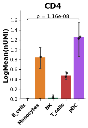
Create a barplot showing the mean expression of a given gene including the p-value to indicate if there is a significant statistical difference between groups.
import dotools_py as do
adata = do.dt.example_10x_processed()
do.pl.barplot(adata,  'annotation', 'CD4', reference = 'pDC', groups=['B_cells'], xticks_rotation=45, ylim_max=2)
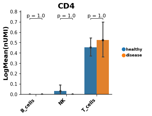
Setting the
hueargument allow to test across conditions for several groups.# Take only lymphoid cells lymphoid = adata[adata.obs['annotation'].isin(['T_cells', 'NK', 'B_cells'])].copy() do.pl.barplot(lymphoid,'annotation','CD4', hue = 'condition', reference = 'healthy', groups=['disease'], hue_order=['healthy', 'disease'], xticks_rotation=45, figsize=(6, 4))
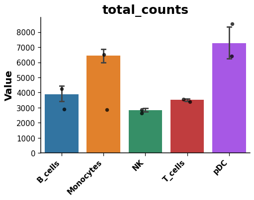
Plot a continuous value in
adata.obs.do.pl.barplot(adata,'annotation','total_counts', figsize=(6, 4), show=False)