dotools_py.pl.correlation#
- dotools_py.pl.correlation(adata, group_by='batch', figsize=(3, 4), ax=None, palette='RdBu_r', ticks_size=12, path=None, filename='Correlation.svg', show=True, method='pearson', mode='letters', mask=None, square=True, linewidths=0.1, linecolor='black', annot=True, annot_fontsize=15, annot_color='white', annot_kws=None)[source]#
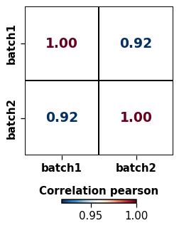
Calculate correlation between samples.
Calculates the pearson, spearman or kendall correlation between categorical metadata for all the genes and plot it using a heatmap representation. There are two modes:
letters: the color of the squares will be white and the correlation values will be colored based on a gradientcolors: the squares will be colored based on a gradient and the letters will be white.
The gradient is defined based on the provided palette. The input is expected to be log-normalised data.
- Parameters:
- adata
AnnData Annotated data matrix.
- group_by
str(default:'batch') Name of a categorical column in
adata.obsto groupby.- figsize
tuple(default:(3, 4)) Figure size, the format is (width, height).
- ax
Axes|None(default:None) Matplotlib axes to use for plotting. If not set, a new figure will be generated.
- palette
str|list|LinearSegmentedColormap(default:'RdBu_r') String denoting matplotlib colormap. If a list of colors is provided a colormap will be generated.
- ticks_size
int(default:12) Size of the X and Y axis ticks.
- path
str|PathLike[str] |Path(default:None) Path to the folder to save the figure.
- filename
str(default:'Correlation.svg') Name of file to use when saving the figure.
- show
bool(default:True) If set to
False, returns a dictionary with the matplotlib axes.- method
Literal['spearman','pearson','kendall'] (default:'pearson') Method to use to calculate correlation: Pearson, Spearman or Kendall.
- mode
Literal['colors','letters'] (default:'letters') Indicate how the correlation is represented.
- mask
Literal['upper','lower'] (default:None) If set to
lowerorupperhide the upper or lower triangle of the heatmap, respectively.- square
bool(default:True) If
True, set the Axes aspect to “equal” so each cell will be square-shaped.- linewidths
float(default:0.1) Width of the lines that divide each cell.
- linecolor
str(default:'black') Color of the lines that divide each cell.
- annot
bool(default:True) Add text with correlation values to the squares.
- annot_fontsize
int(default:15) Size of the font.
- annot_color
str(default:'white') Color of the font. Will be ignored when mode is
letters.- annot_kws
dict|None(default:None) Additional Keyword arguments for matplotlib.axes.Axes.text()
- adata
- Return type:
- Returns:
Depending on
show, returns the plot if set toTrueor a dictionary with the axes.
Example
import dotools_py as do
adata = do.dt.example_10x_processed()
do.pl.correlation(adata, 'batch')